Digital Brochure

for Merrill Edge

"The push to digital", a phrase feared by most institutions; but when customers are faced with endless print collateral with little-to-no useful information, an interactive, device-agnostic piece, consolidating all the helpful info, may just be the hero in this story.

When financial service advisors met with potential clients, they had few options of information to send home with them: printed brochures with little information, or websites that weren't very good. Merrill Edge wanted to provide a take-away that could help consumers recall their conversation with an advisor and understand the options that might be best for them.

Here's how we got there.
Brainstorming

Brainstorming with the client, and interviewing financial service advisors, helped us understand the need and define the project's deliverable.

Our goal: a single digital brochure that would help both advisors and investors, and allow users' to get a customized outcome if they wanted

User Journey Mapping

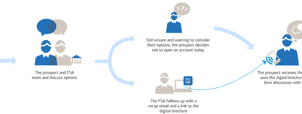
The UX team creates a master user journey and identifies where the brochure will be used. These journeys helped our team and the client visualize what would be needed from this project, and how the end product could be used in different scenarios.

At the same time, content strategy figures out what we're working with, taking inventory of existing printed brochures

See the full user journeys

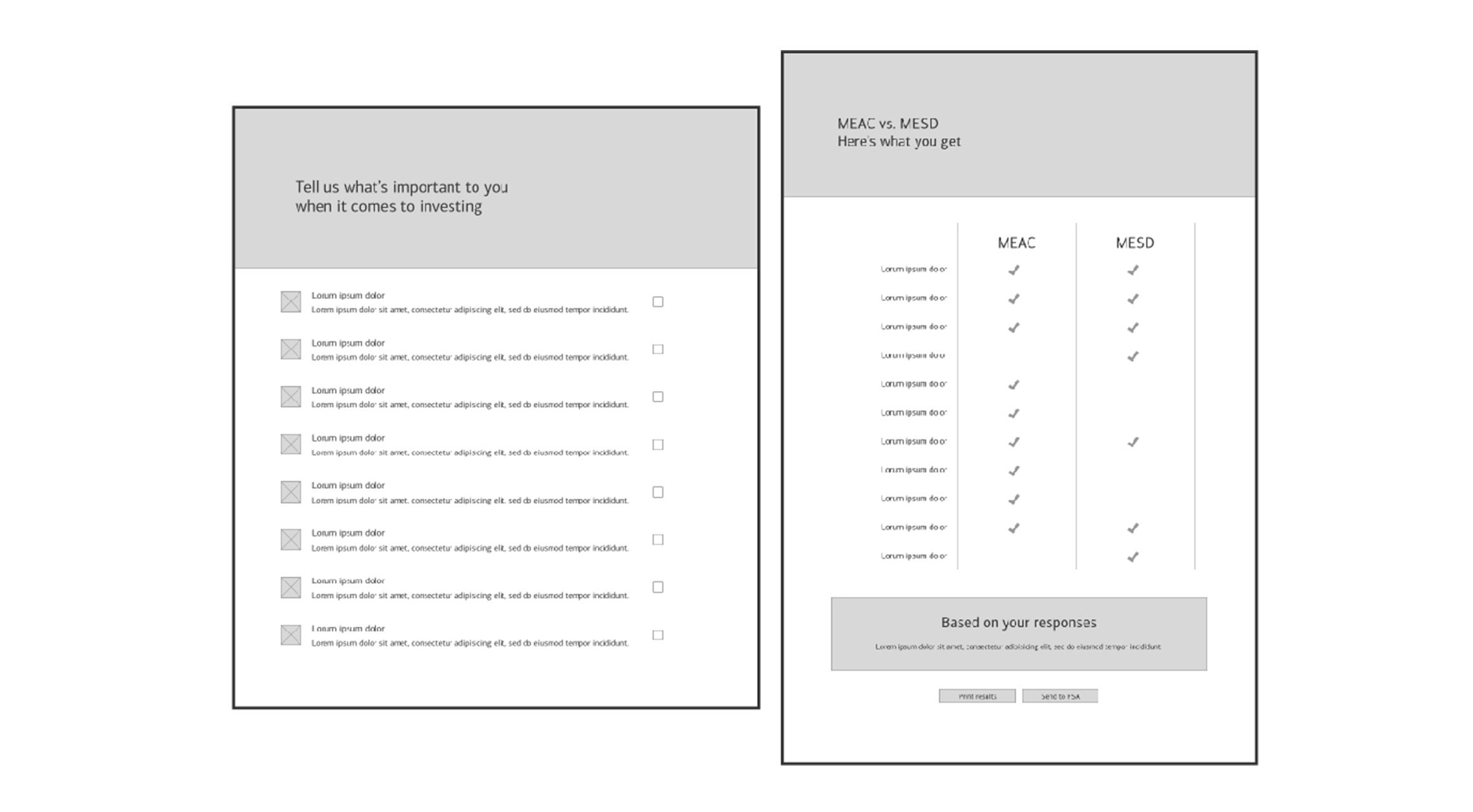
Wireframing let the team decide what content to use, and what our core user flow looks like

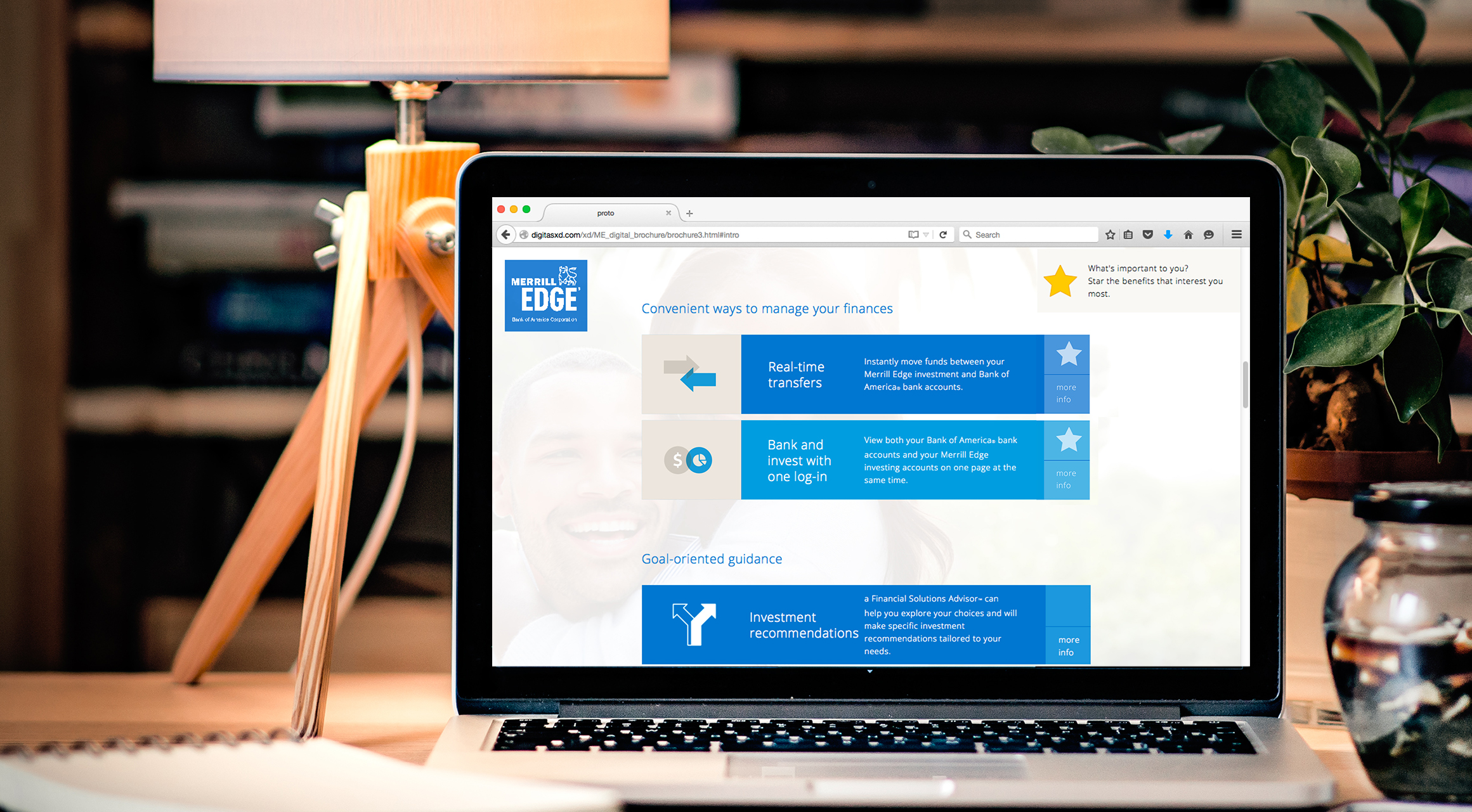
UI design gave us an opportunity to breath new life into a somewhat anemic visual brand. Initial prototyping explored animation and interactions.

The Finished Product

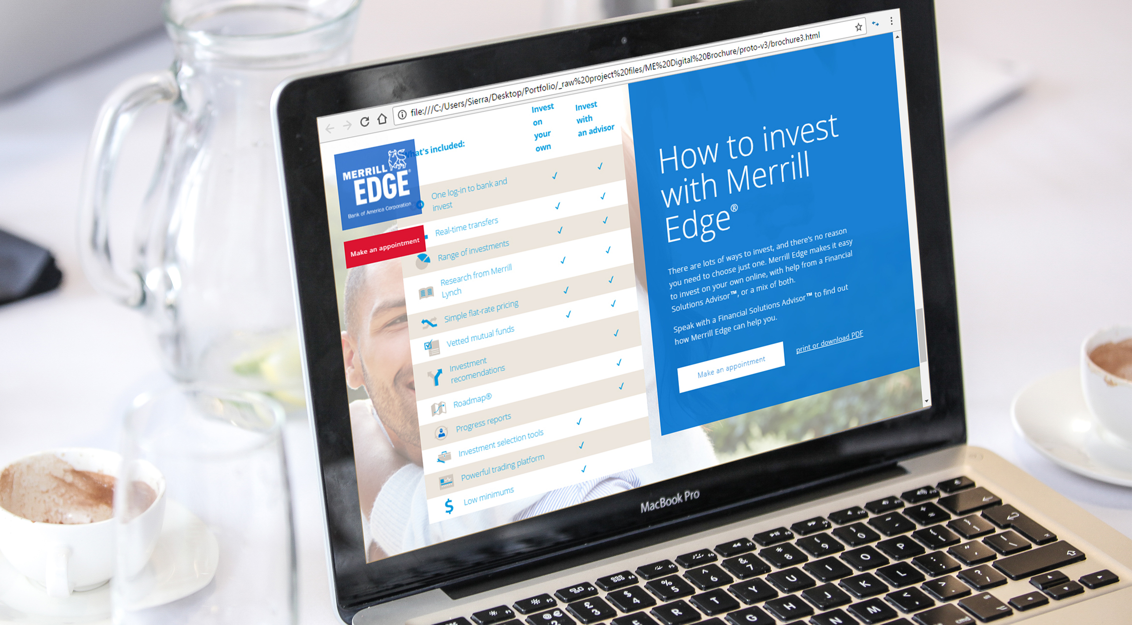
A polished prototype for client presentation. A hand-coded an HTML prototype of the brochure brought the work to life with animations and interaction, using CSS3 and JavaScript.

LinkedIn
AngelList