Visual Concepts
for Veritas Genetics
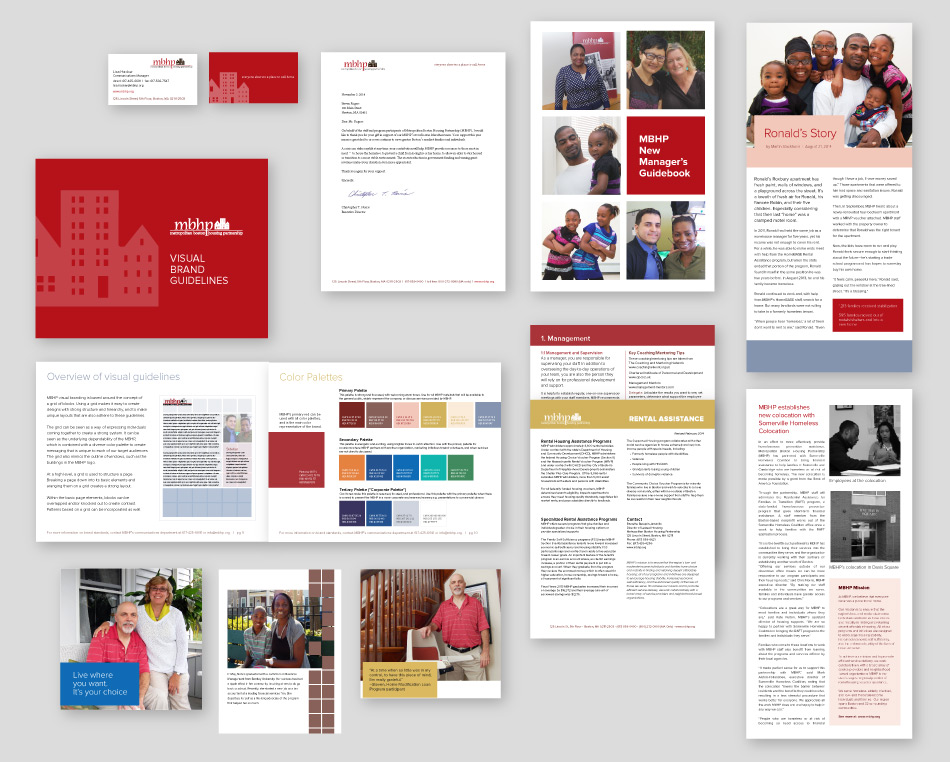
With their resources stretched and their days spent focusing on the community, the MBHP team had little time to worry about the visual consistency of their many publications.
MBHP wanted to present a more cohesive image by bringing their materials under a single visual identity system. With no in-house designers, little time and budget for redesigns, and a lot of existing collateral, the identity system we would create needed to be contemporary but also allow for a phased roll-out.
The identity system had to be easy to use for the small in-house marketing team, and the players on the ground: in the community and corporate board rooms.
The system needed flexibility to support messaging for multiple demographics. For funders and decision-makers, a professional and contemporary feel, able to extend to handouts and Powerpoint presentations. For participants and internal audiences, the system needed to be approachable and visually consistent.
And, as mentioned, it needed to incorporate existing visual conventions into a single system that would be a natural extension of the existing materials.
Our primary goal: to expand MBHP’s visual identity, and create an easy-to-use guide and system of reusable elements.
Here’s what we covered:

Without an underlying grid structure, colors, patterns, and typefaces can easily become meaningless decoration. The grid outlines how to consistently structure design elements throughout all MBHP’s collateral.
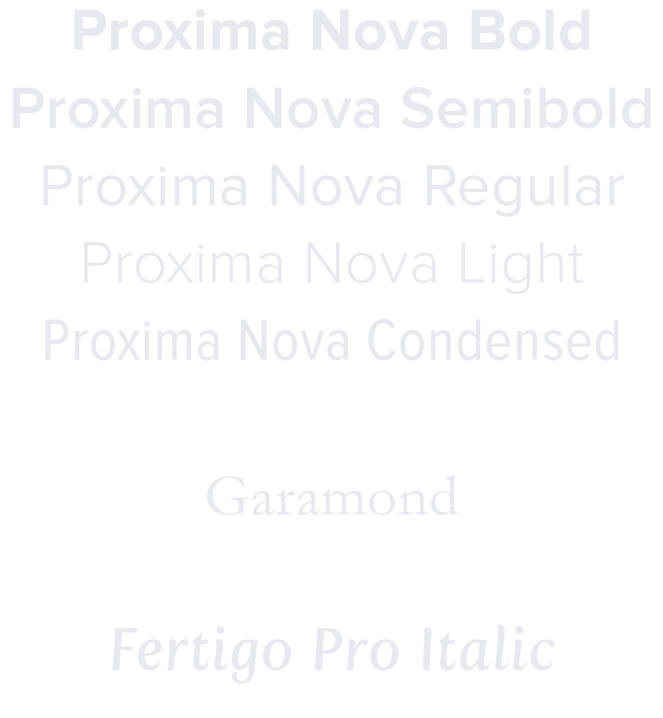
Due to the lack of in-house design resources, choosing typefaces that improved the brand but were also readily available was a challenge.
Fallback typefaces were also specified in the case of EXTREMELY limited resources and, of course, email.

MBHP’s existing red was in wide use, and would serve as a way to tie older material to the new visual identity. But they needed additional options to help customize designs while keeping a consistent look-and-feel; the palette was expanded to provide additional options for different audiences.
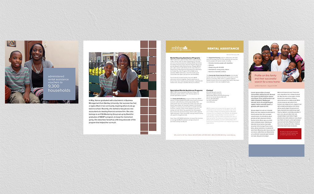
Photos are an essential part of the identity, helping to convey the very human brand of MBHP. Photo treatments and various iconography-based patterns were introduced to create visual interest and allow for a multitude of visual combinations, all within the same visual style.